← Back to Homepage Download CV

Astro

UX Design for a Tech Product Comparison App

A concept project to reduce friction when buying electronics online—clearer flows, smarter choices.

Problem

Many people feel overwhelmed when trying to compare specs, prices, and availability of tech products across sites. There's too much noise, little structure, and a lack of trusted recommendations. The result? Decision fatigue and delayed purchases.

Research

I explored forums, Reddit threads, and spoke with tech-savvy friends to understand their behavior. Key pain points included:

These insights shaped Astro's concept: centralize smart comparisons + user-contributed suggestions.

UX Process

I defined key features: product search, alternatives suggestion, and simplified checkout.

Then I sketched flows, created wireframes, and developed UI mockups in Figma—focusing on clarity, hierarchy, and ease of scanning specs.

I designed screens for:

  • Search results with filters
  • Product detail comparison
  • Simple checkout journey

Testing & Results

I created two versions of login and checkout flows and tested preferences with users. The feedback helped me simplify labels and reduce steps. Though the project stayed at concept level, it validated that smoother UX boosts trust.

Key Screenshots

Astro Mobile App Mockups
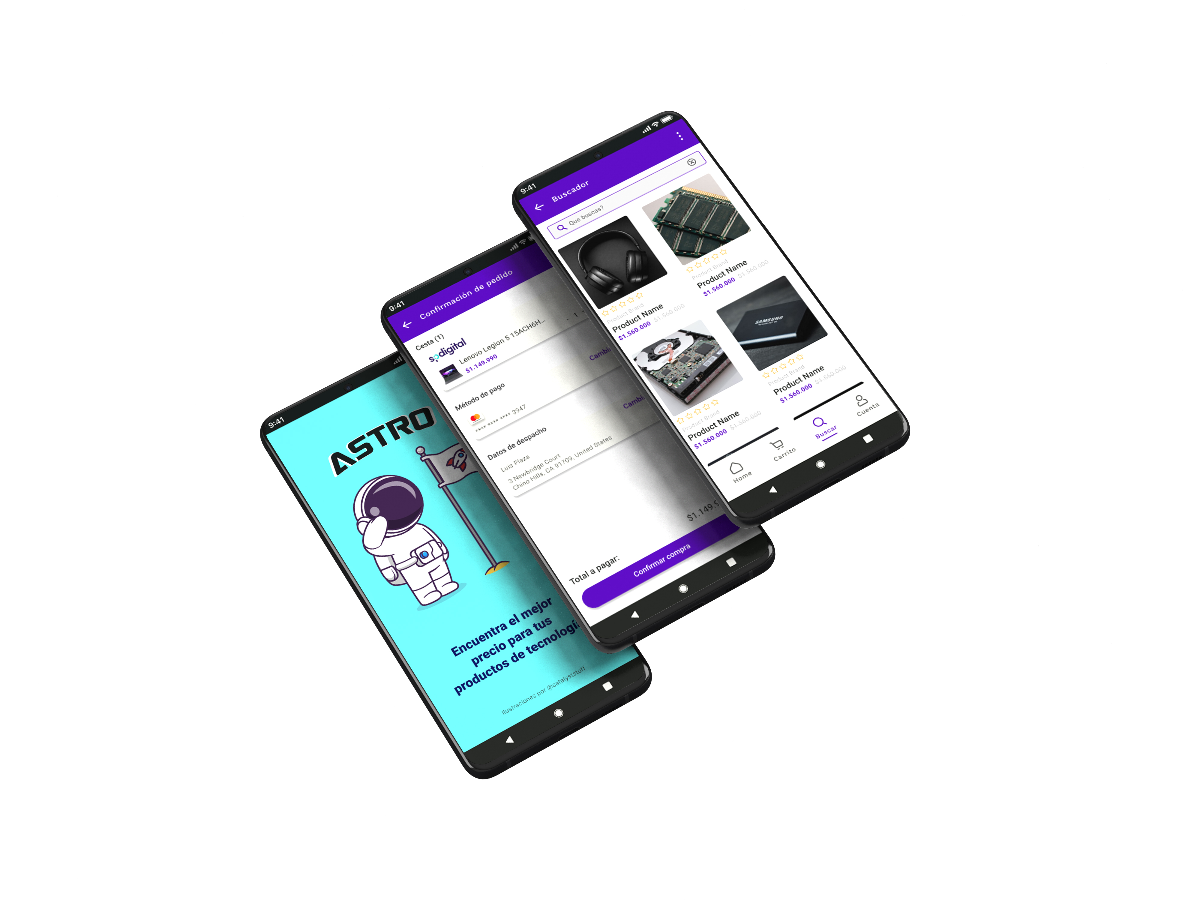
Mobile app mockups showing the splash screen, checkout flow, and search results
Astro Low-Fidelity Wireframes
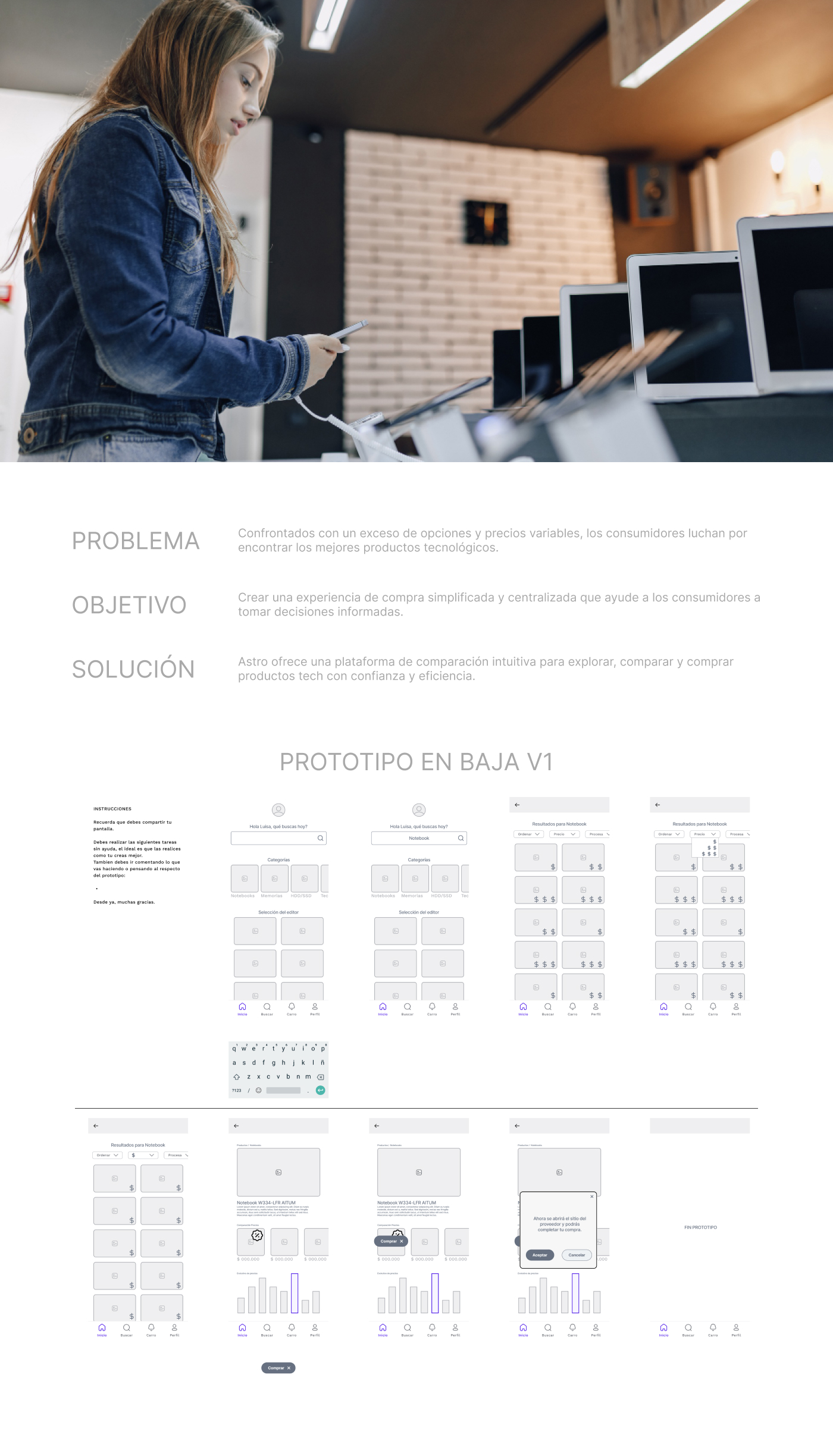
Low-fidelity wireframes showing the complete user flow and information architecture
Astro High-Fidelity Prototypes
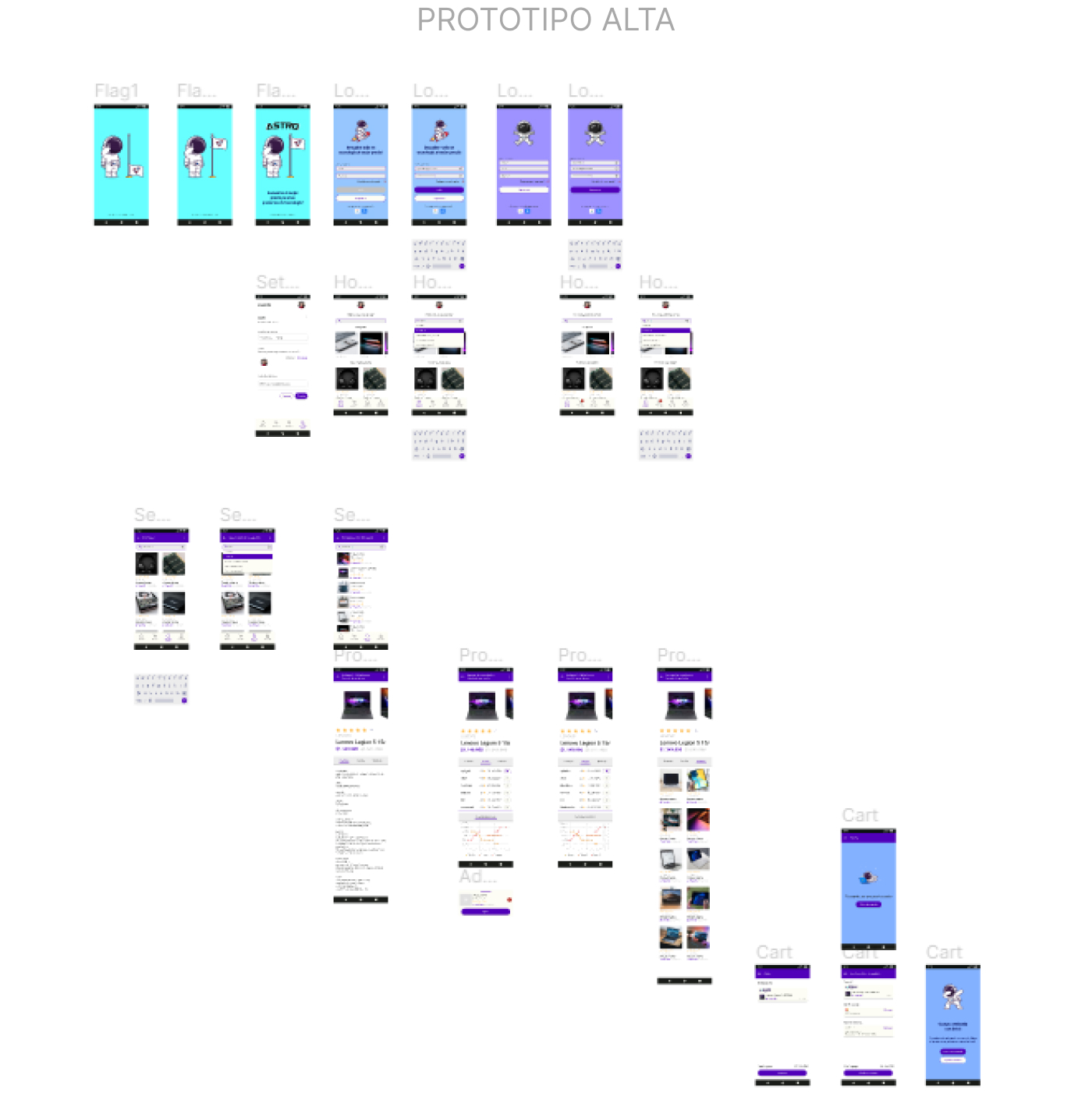
High-fidelity prototypes with detailed UI design and complete user journey

Learnings

Astro reminded me that good UX isn't about features—it's about confidence. Giving users clarity and control helps them commit faster. Even without shipping the product, the design process itself taught me how to reduce friction with structure.